Family base entry: Bar & Rectangular Marks, which opens with the Vertical Bar preset.
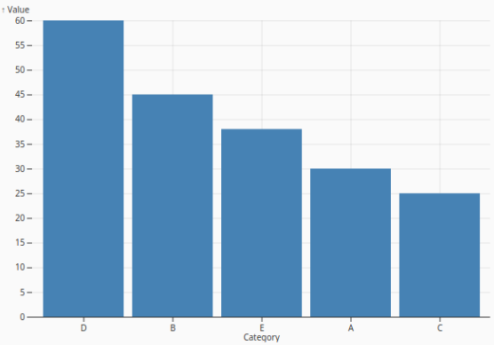
Vertical Bar
VerticalBarChart
Compares values across categories using vertical bars, making it easy to see which categories are larger, smaller, or roughly equal at a glance. This is the default opening preset for the Bar & Rectangular Marks family.
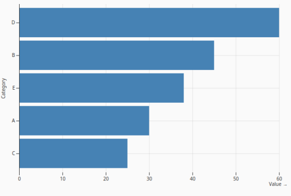
Horizontal Bar
HorizontalBarChart
Compares categorical values using horizontal bars. This layout is especially useful when category labels are long, when rankings need to be easy to scan, or when available vertical space is limited.
Grouped Bar
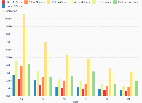
GroupedBarChart
Places related series side by side within each category so multiple measures or groups can be compared directly. It is useful for showing differences between subgroups without stacking their values together.
Diverging Bar
DivergingBarChart
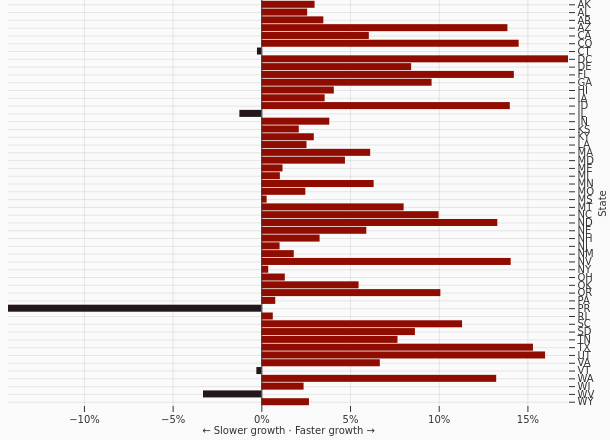
Extends values in opposite directions from a shared baseline to highlight gains, losses, positive and negative values, or deviations from a reference point. This makes contrast around zero or another midpoint immediately visible.
Diverging Stacked Bar
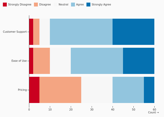
DivergingStackedBars
Displays ordered response categories as stacked segments extending to both sides of a midpoint. It is well suited for survey, sentiment, or agreement-scale data where negative and positive responses should be compared around a neutral center.
Histogram
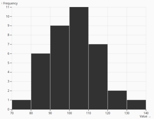
Histogram
Description: Groups a continuous variable into intervals and displays the frequency of values in each bin. It helps reveal the distribution shape, including concentration, spread, skew, and potential gaps or outliers.
Stacked Histogram
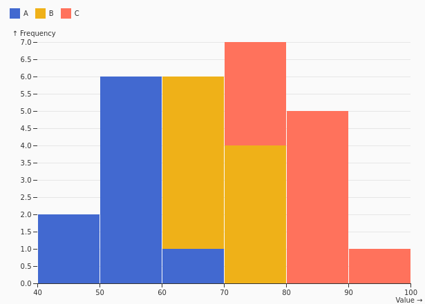
StackedHistogram
Splits each histogram bin into stacked subgroups, allowing the overall distribution and subgroup contribution to be viewed together. It is useful when both frequency and composition matter.
Overlapping Histogram
OverlappingHistogram
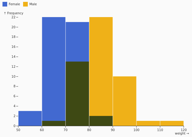
Overlays multiple distributions on the same bin structure so their shapes can be compared directly. This helps identify differences in spread, central tendency, and distribution patterns between groups.
Pre-binned Histogram
PreBinnedHistogram
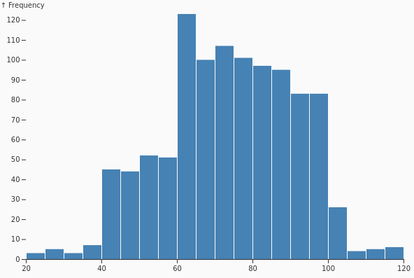
Displays data that has already been aggregated into bins before reaching the chart. It is useful when bin counts are calculated externally or when the source data is already summarized.
Stacked Bar
StackedBar
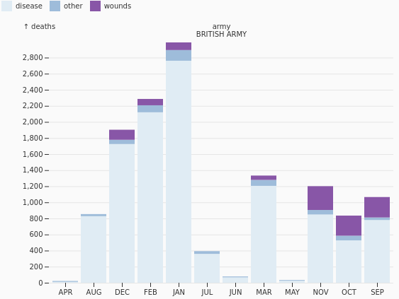
Shows total values while also breaking each total into subcategory contributions. It is useful for part-to-whole comparisons across categories, especially when the overall magnitude remains important.
Stacked Rect
StackedRects
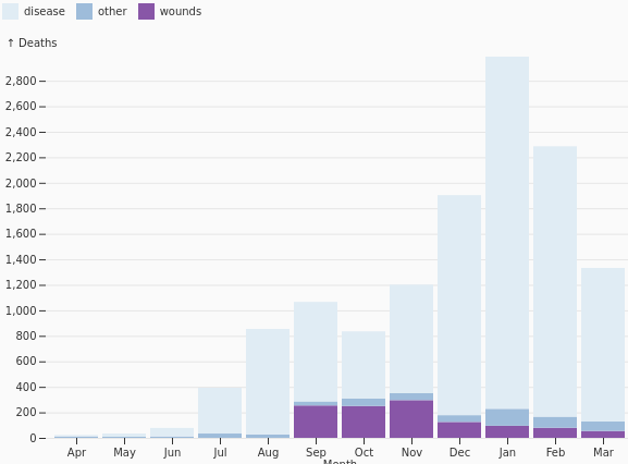
Uses stacked rectangular segments along a continuous axis to show how parts combine into a whole. This works well for compact proportional displays and continuous part-to-whole encodings.
Bullet Graph
BulletGraph
Compares an actual measure against a target while also showing qualitative performance ranges. It provides a compact performance summary that can replace gauge-style visuals with a more precise linear design.
Percentogram
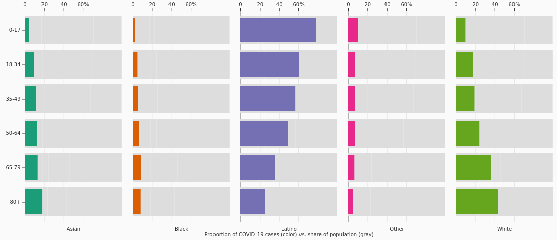
Percentogram
Displays histogram bins as percentages instead of raw counts. This makes distributions easier to compare when datasets have different total sizes or when relative frequency is more important than absolute volume.
Stacked Waffle
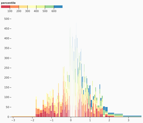
StackedWaffle
Represents part-to-whole relationships using a grid of equal units grouped into stacked categories. It is useful for communicating proportions in a visually approachable, countable format.
Survey Waffle
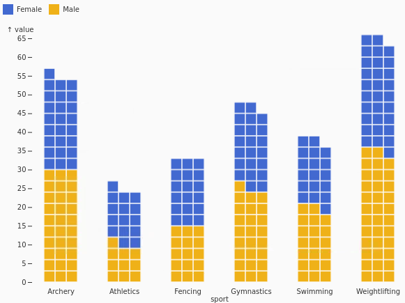
SurveyWaffle
Displays survey response percentages as a waffle grid. It helps audiences understand response distribution through discrete units, making proportions feel concrete and easy to compare.
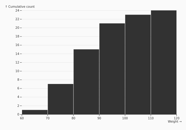
Cumulative Histogram
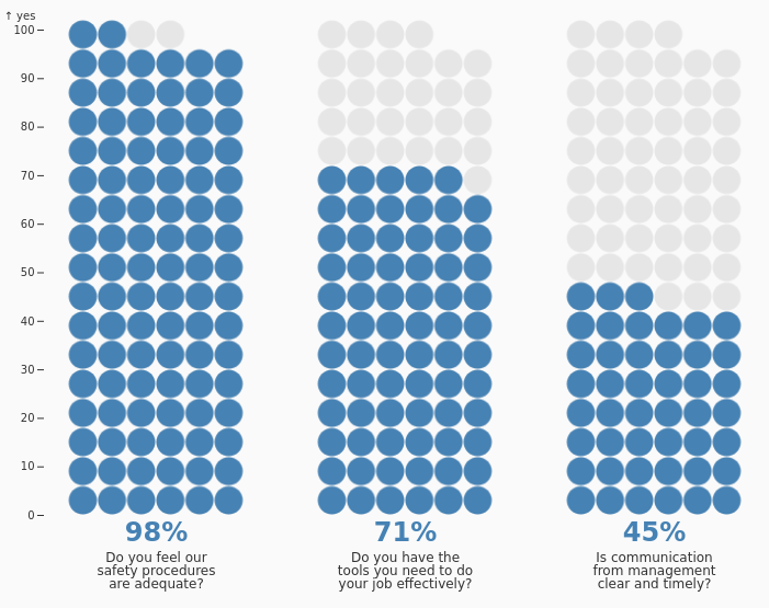
CumulativeHistogram
Accumulates each bin with all preceding bins to show a running distribution. It is useful for understanding thresholds, percentiles, cumulative frequency, and how quickly values build across a range.
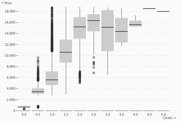
Binned Box Plot
BinnedBox
Summarizes distributions within bins using statistical markers such as quartiles, medians, and ranges. It is useful when each bin contains enough values to compare spread and central tendency rather than just frequency.
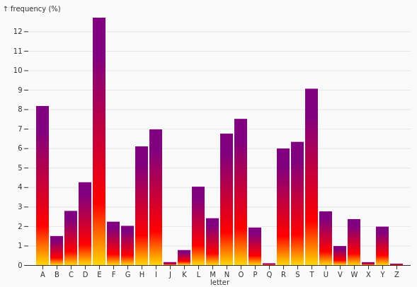
Gradient Bars
GradientBars
Fills bars with a gradient to add emphasis or encode an additional dimension. This can make magnitude changes more visually expressive while preserving the familiar bar-based structure.
Stacked Unit
StackedUnit
Represents quantities as stacks of discrete, countable units. It is useful when each unit has meaning and the chart should communicate both total amount and individual count structure.
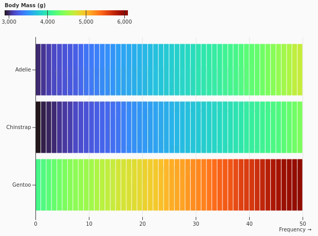
Warming Stripes
WarmingStripes
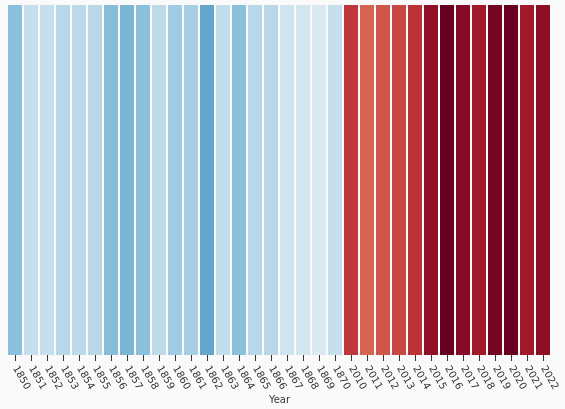
Uses colored stripes to reveal long-term sequential trends, commonly temperature change over time. The format removes visual clutter and emphasizes the overall pattern through color progression.
Heatmap
Heatmap
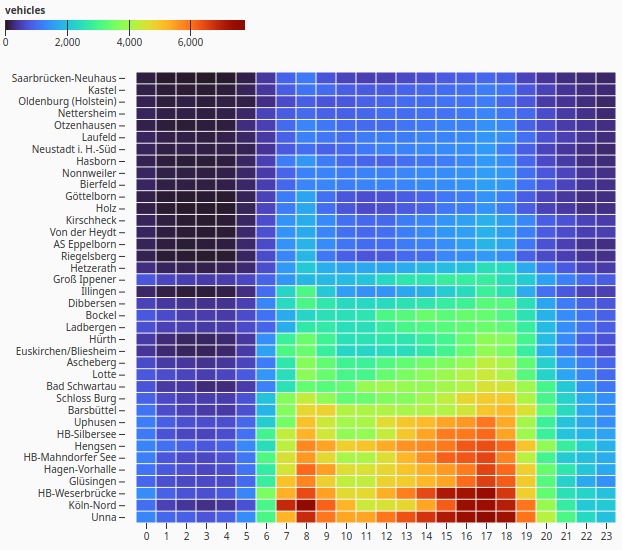
Encodes values as cell color within a categorical grid. It is useful for finding clusters, highs, lows, and patterns across two categorical dimensions.
Heatmap Continuous
HeatmapContinuous
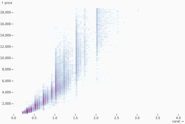
Encodes values as color across continuous x and y ranges. It is useful for density-like surfaces, continuous measurement fields, or any scenario where value intensity changes over a two-dimensional space.
Temporal Heatmap
TemporalHeatmap
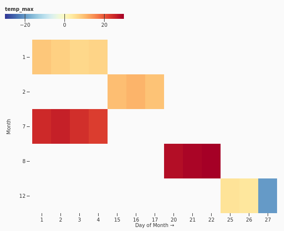
Arranges time-series values in a time-by-category or time-by-period grid and colors each cell by magnitude. It helps reveal seasonality, recurring patterns, gaps, and unusual periods.
Calendar
Calendar
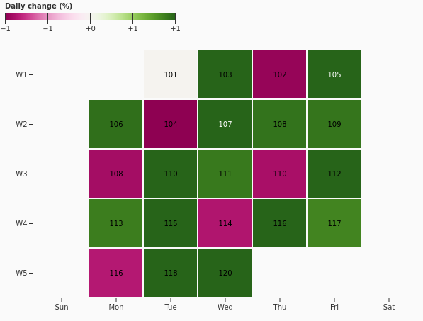
Maps daily values into a calendar layout and colors each day by magnitude. It is ideal for spotting daily patterns, streaks, missing days, and seasonal changes in date-based data.
Correlation Heatmap
CorrelationHeatmap
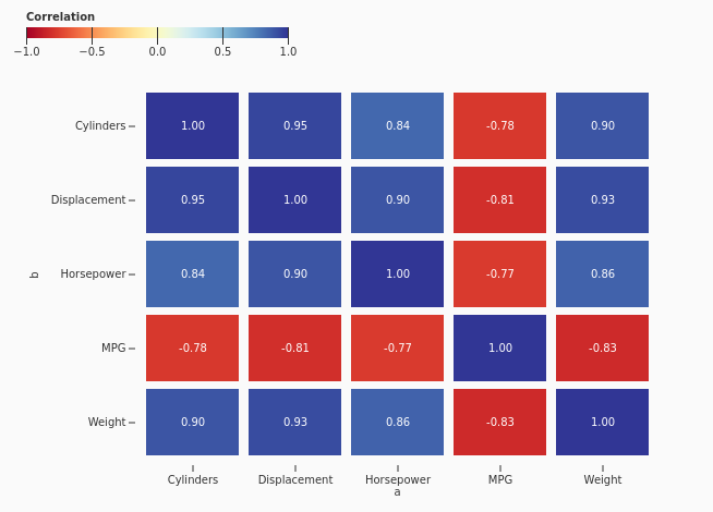
Displays the strength and direction of pairwise correlations in a matrix. It is useful for quickly identifying related variables, redundant measures, or relationships that deserve deeper analysis.
Marimekko
Marimekko
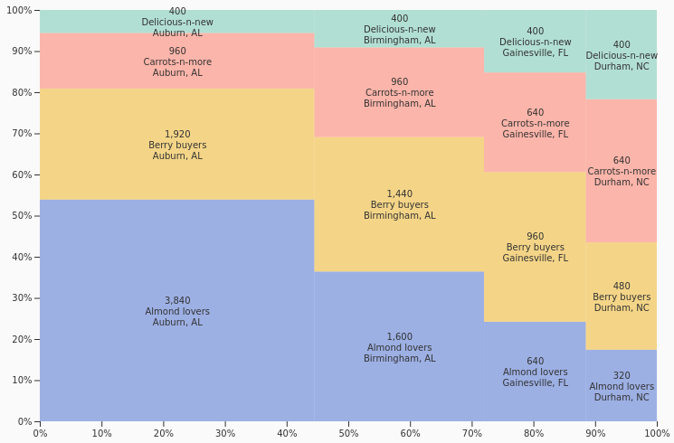
Uses both rectangle width and height to compare two part-to-whole dimensions at once. It is useful for showing how category size and internal composition interact in a single rectangular layout.
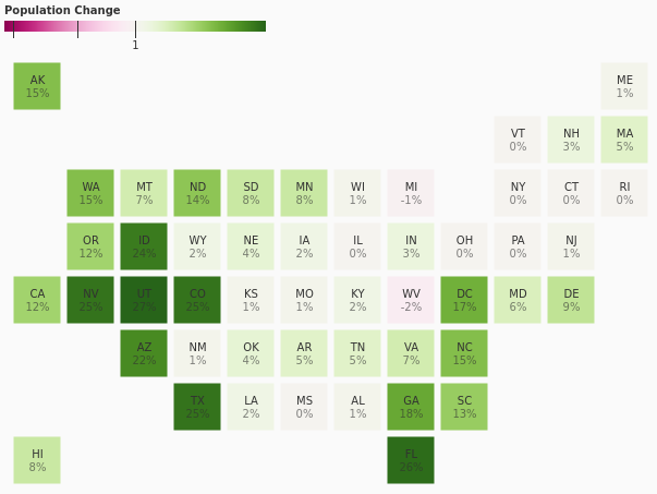
Grid Choropleth
GridChoropleth
Represents geographic regions with uniformly arranged grid cells colored by value. It keeps region areas visually consistent, making comparisons less dependent on real-world geographic size.