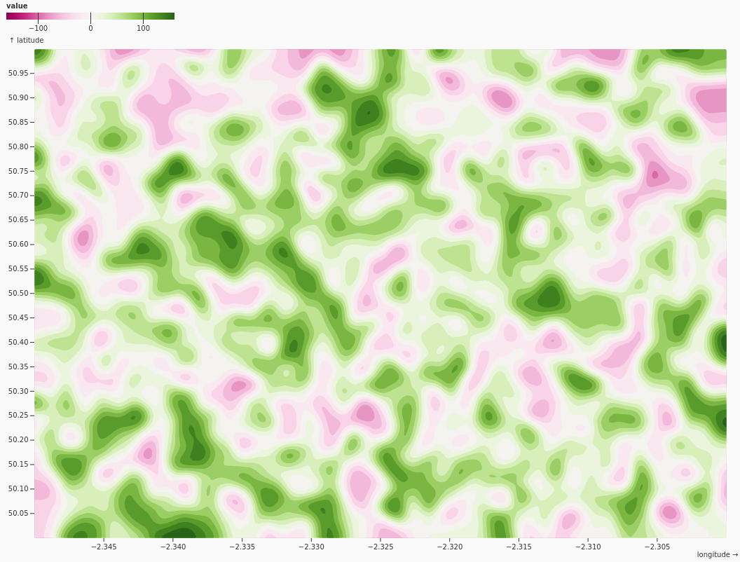
Family base entry: Density & Contour Plots, which opens with the Function Contour preset.
Example mark structure:
{
  "data": [
    { "x": 1.2, "y": 4.1 },
    { "x": 1.4, "y": 4.0 },
    { "x": 2.2, "y": 3.6 }
  ],
  "color": { "scheme": "blues", "legend": true },
  "marks": [
    {
      "type": "density",
      "options": { "x": "x", "y": "y", "fill": "density", "thresholds": 20 }
    }
  ]
}
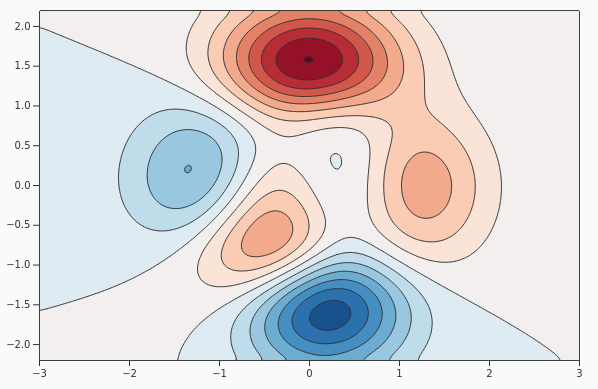
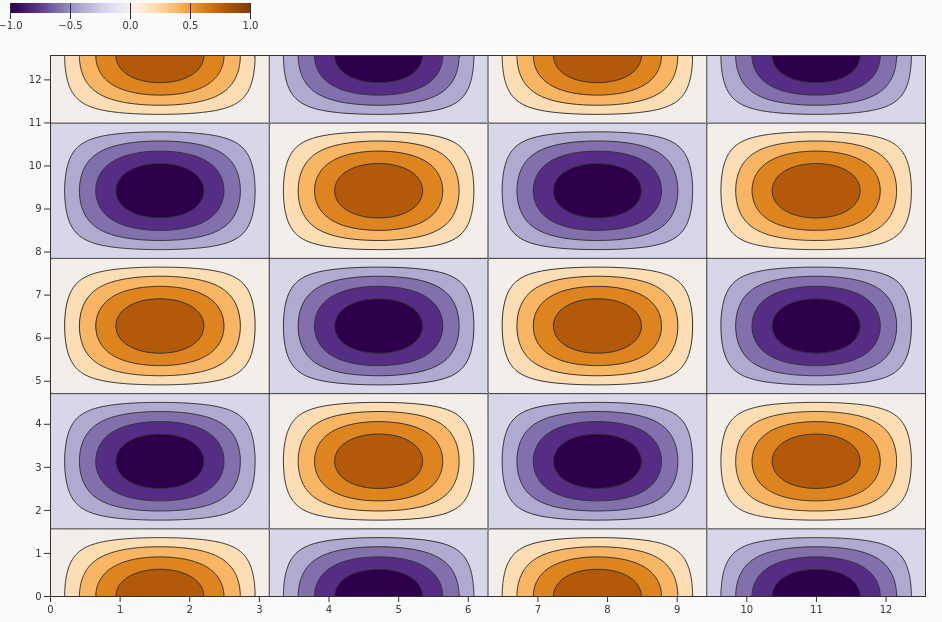
Function Contour
FunctionContour
Draws equal-value contour lines for a mathematical surface on a two-dimensional plane, making it easier to understand gradients, peaks, valleys, and transition zones in modeled or computed data.
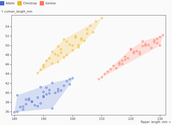
Non-overlapping density regions
NonOverlappingContour
Separates or layers density regions so multiple distributions can be compared without visually obscuring one another, helping readers identify distinct clusters and areas of overlap more clearly.
Density Plot
DensityPlot
Estimates and displays the concentration of observations over a continuous two-dimensional space, highlighting where data points are most densely clustered and where values become sparse.
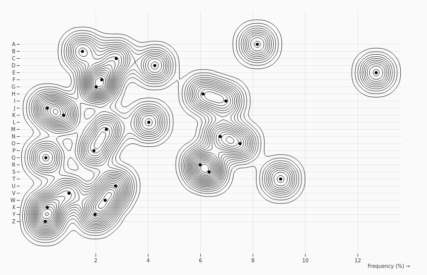
1D Density
OneDimensionalDensity
Shows the smoothed distribution of a single continuous variable, providing a continuous alternative to a histogram for identifying peaks, spread, skew, and distribution shape.

Faceted Function Contour
FacetedFunctionContour
Uses small-multiple contour plots to compare how a mathematical surface varies across categories, groups, or scenarios while preserving a consistent visual structure for side-by-side interpretation.
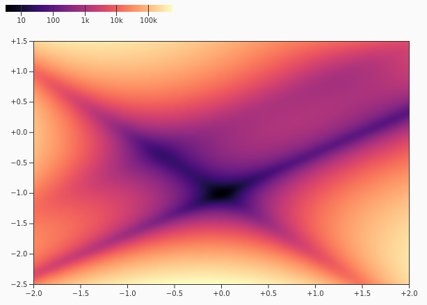
Log Heatmap
LogHeatmap
Uses logarithmic color scaling to reveal patterns in values that span a wide range of magnitudes, preventing large values from dominating the visualization while keeping smaller variations visible.
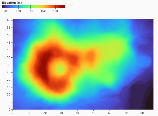
Volcano Raster
VolcanoRaster
Displays gridded elevation or similar matrix-based data as a raster image, using color to represent continuous values across a regular spatial field.
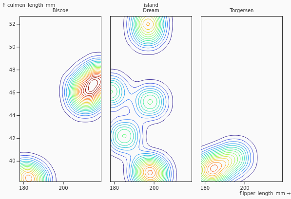
Density Faceted
DensityFaceted
Compares density estimates across facets using shared thresholds or visual scales, making it easier to evaluate differences in concentration, shape, and distribution between groups.
Point Cloud Density
PointCloud
Estimates density within a large scatterplot or point cloud to reveal concentrated regions, reducing visual clutter when many individual points would otherwise overlap.
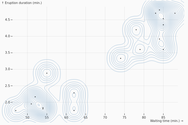
Multiclass Density
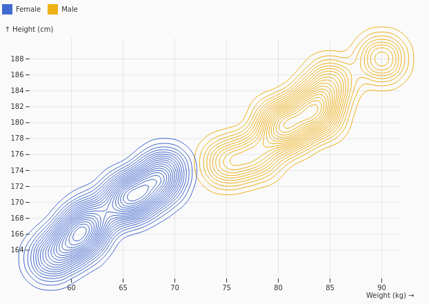
MulticlassDensity
Compares two-dimensional density estimates for multiple classes, helping show where categories occupy distinct spaces and where their distributions intersect.
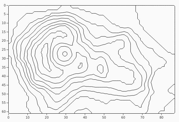
Stroked Contours
StrokedContours
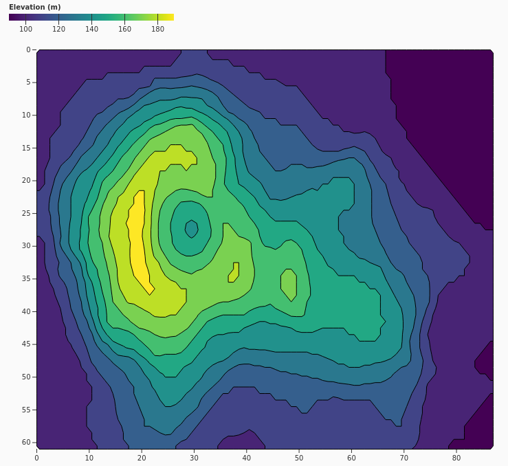
Emphasizes isolines with stroked contour paths rather than filled bands, making boundaries and equal-value levels clear while keeping the underlying space visually open.
Filled Contours
FilledContours
Fills the regions between contour thresholds with discrete colors, allowing readers to quickly distinguish value bands and interpret changes across a continuous surface.
Blurred Contours
BlurredContours
Smooths the source field before generating contours, reducing noise and revealing broader spatial patterns, trends, or gradients in the data.