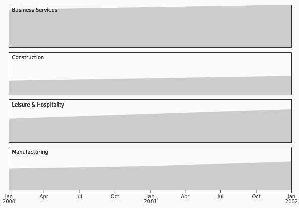
Family base entry: Line & Area, which opens with the Line preset.
Example mark structure:
{
  "data": [
    { "date": "2026-08-19", "value": 42 },
    { "date": "2026-08-20", "value": 48 },
    { "date": "2026-08-21", "value": 45 }
  ],
  "x": { "type": "utc", "label": "Date" },
  "y": { "grid": true, "label": "Value" },
  "marks": [
    {
      "type": "lineY",
      "options": { "x": "date", "y": "value", "tip": "xy" }
    }
  ]
}
Line
LineChart
Connects ordered values to show a trend, commonly over time.
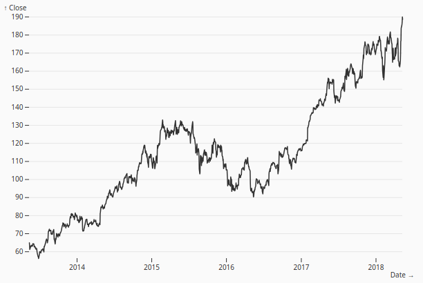
Multi-line
Multiline
Compares trends for multiple series over the same domain.
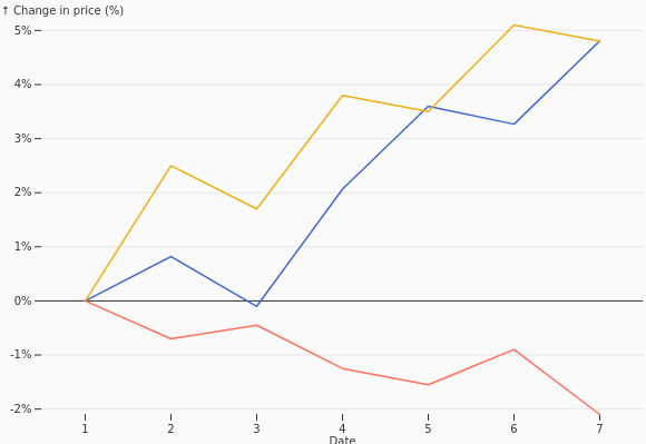
Labeled Multi-line
LabeledMultiline
Labels series directly on their lines instead of relying only on a legend.
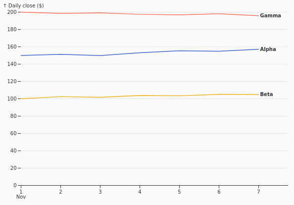
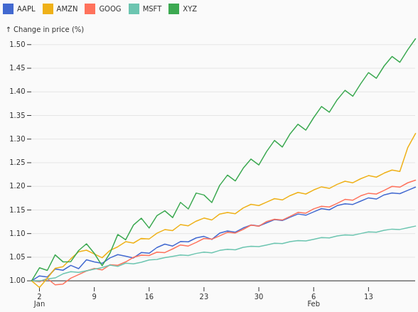
Index
Index
Rebases several series to a common starting value to compare relative change.
Area
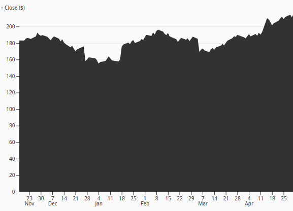
Area
Fills the region below a line to emphasize magnitude or accumulated volume.
Area Gradient
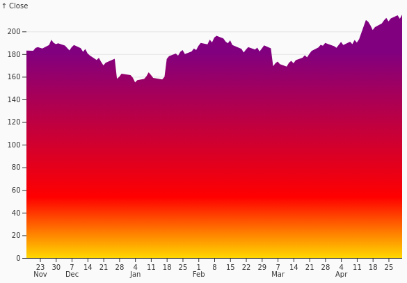
AreaGradient
Uses a gradient-filled area for emphasis or additional value encoding.
Difference
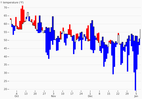
Difference
Shades the gap between two series to show which is larger and by how much.
Burndown
Burndown
Tracks remaining work against time, typically for an iteration or project.
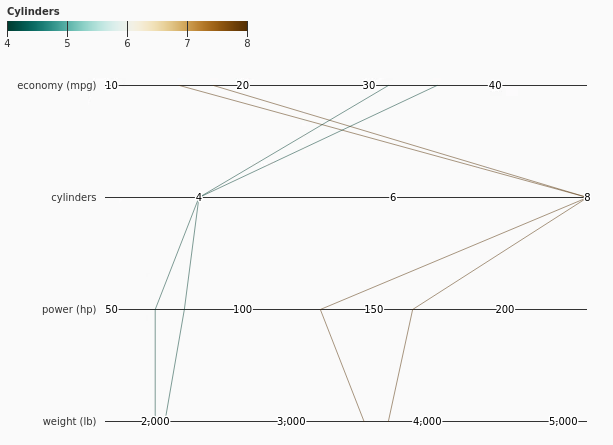
Parallel Coordinates
ParallelCoordinates
Draws one polyline across several variable axes to compare high-dimensional records.
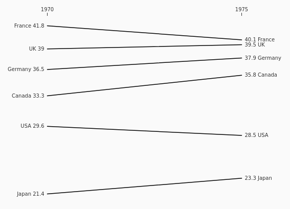
Slope Chart
Slope
Highlights change between two points using the direction and steepness of connecting lines.
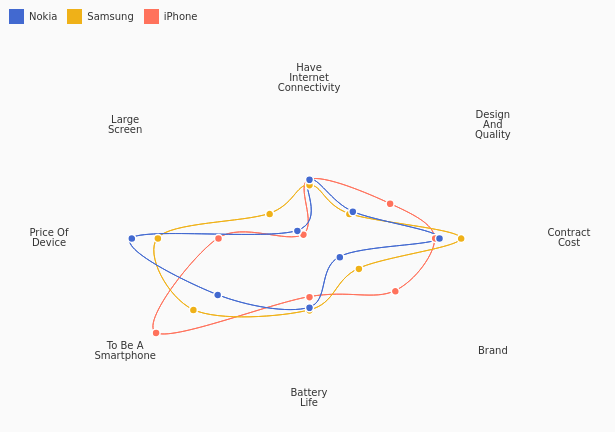
Radar Chart
Radar
Compares several quantitative measures on radial axes sharing one origin.
Connected Scatterplot
ConnectedScatterplot
Connects scatter points in sequence to show how two variables evolve together.
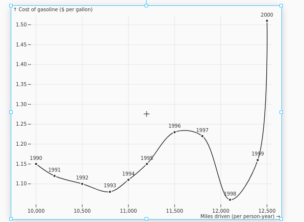
Continuous Histogram
ContinuousHistogram
Displays a smoothed estimate of a continuous distribution.
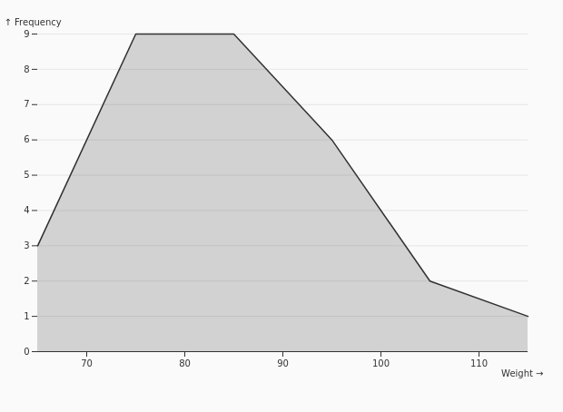
Overlapping Density
OverlappingDensity
Overlays smoothed distributions for several groups.
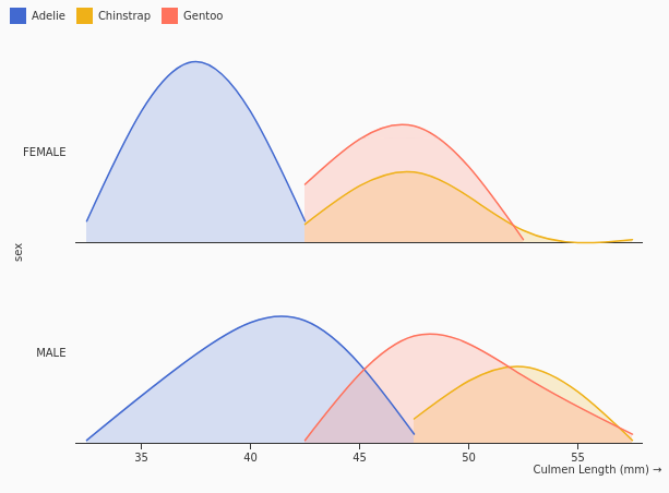
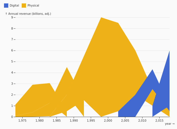
Proportion Plot
ProportionPlot
Shows how category shares or percentages change across another dimension.
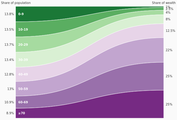
Ribbon Chart
Ribbon
Connects category values with ribbons to emphasize changing rank or flow.
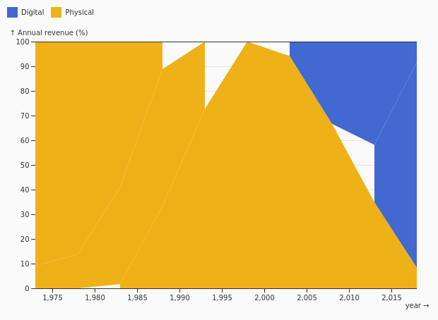
Normalized
Normalized
Normalizes stacked areas to 100% to show changing composition.
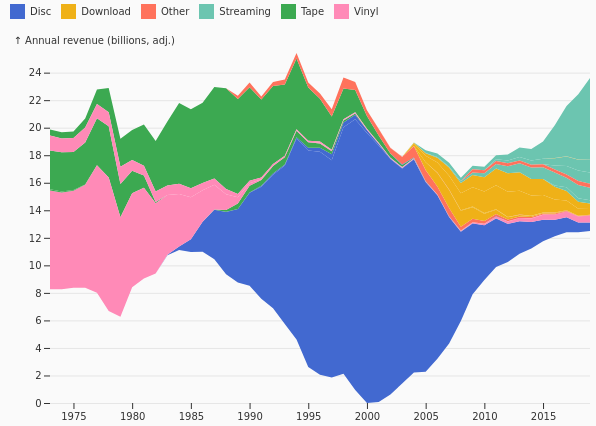
Wiggle Streamgraph
WiggleStreamgraph
Centers stacked areas around a flowing baseline to reduce visual variation.
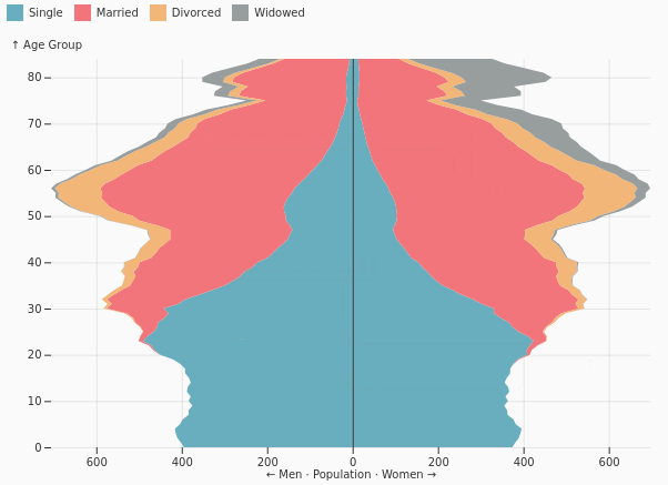
Population Pyramid
PopulationPyramid
Compares two population groups back to back across age or another ordered band.
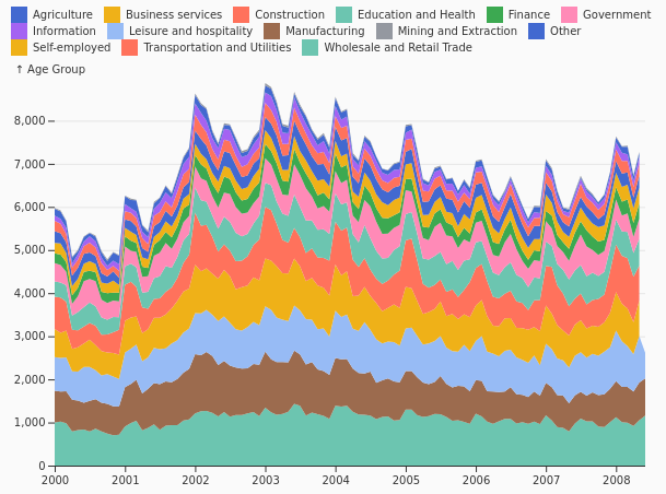
Stacked Areas
StackedAreas
Shows both an evolving total and each series' contribution to it.
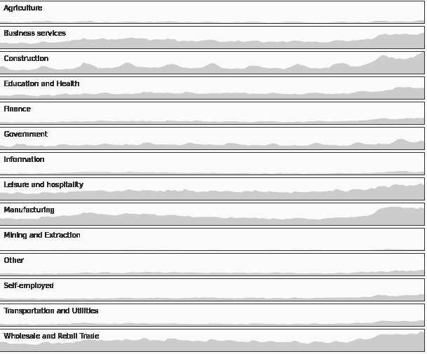
Horizon
Horizon
Folds and layers time-series bands to compare many series in limited vertical space.
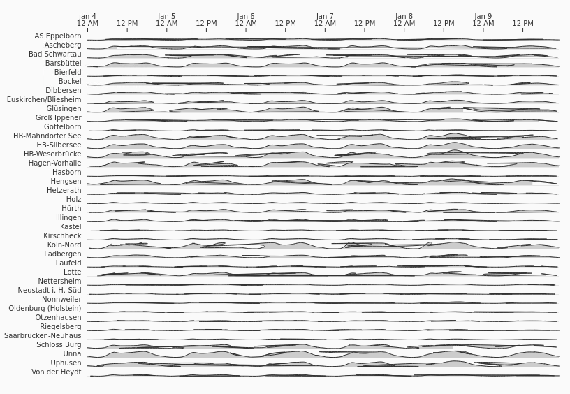
Ridgeline Plot
Ridgeline
Vertically offsets distributions to compare their shapes across categories.
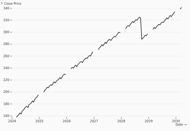
Line /w Missing Data
LineMissingData
Breaks the line at missing observations so gaps are not presented as continuous data.
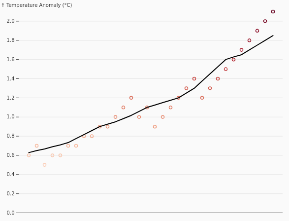
Moving Average
MovingAverage
Smooths short-term variation to reveal the longer-term trend.
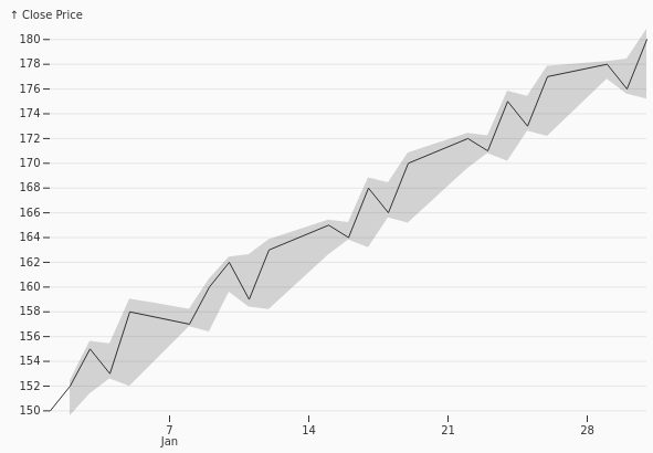
Bollinger Bands
BollingerBands
Surrounds a moving average with upper and lower volatility bands.
Faceted Area
FacetedArea
Uses small-multiple area charts to compare categories independently.