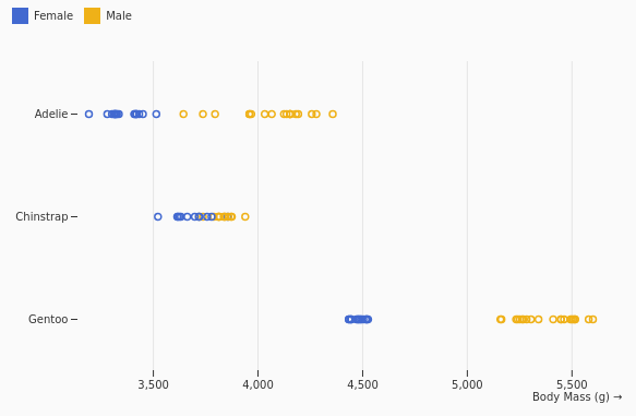
Family base entry: Points & Text, which opens with the Scatterplot preset.
Example mark structure:
{
  "data": [
    { "temperature": 18.2, "pressure": 2.1, "line": "A" },
    { "temperature": 19.4, "pressure": 2.3, "line": "B" }
  ],
  "grid": true,
  "color": { "legend": true },
  "marks": [
    {
      "type": "dot",
      "options": {
        "x": "temperature",
        "y": "pressure",
        "fill": "line",
        "tip": true
      }
    }
  ]
}
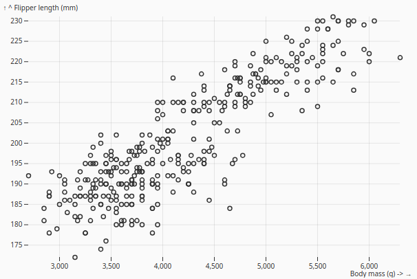
Scatterplot
Scatterplot
Plots two quantitative variables against each other so readers can identify correlation, clustering, spread, and outliers across individual observations.
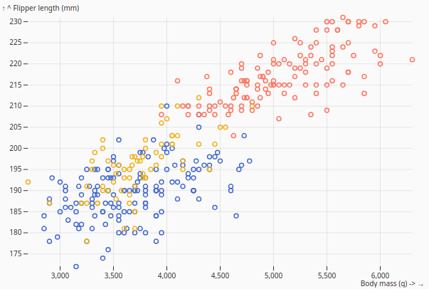
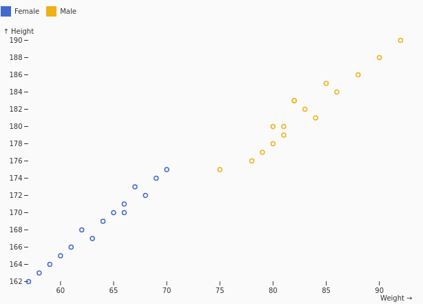
Scatterplot with color
ColorScatterplot
Adds categorical color encoding to a scatterplot, making it easier to compare groups while preserving the underlying x and y quantitative relationship.
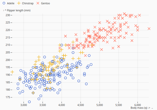
Symbol Scatterplot
SymbolScatterplot
Uses different point shapes to distinguish categories, which is useful when color alone is not enough or when the chart needs to remain readable in grayscale.
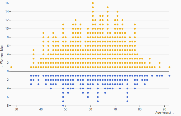
Stacked Dot
StackedDot
Stacks individual dots along one dimension to show distribution density while keeping each dot as a visible unit of data.
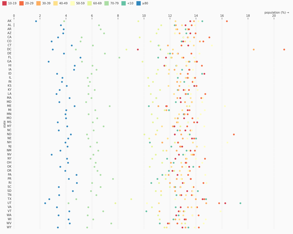
Dot Plot
DotPlot
Places individual observations on a number line or categorical axis so discrete values can be compared without aggregating them into bars or bins.
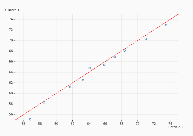
Quantile-Quantile
QuantilePlot
Compares the quantiles of two distributions to evaluate whether they follow a similar shape, scale, or pattern of deviation.
Dot Heatmap
DotHeatmap
Uses dots positioned at grid intersections, with size or color encoding magnitude, to show intensity patterns across two categorical dimensions.
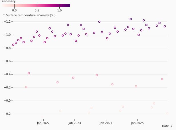
Diverging Scatterplot
DivergingScatterPlot
Applies a diverging color scale to points so positive and negative values, or above- and below-reference conditions, are easy to distinguish.
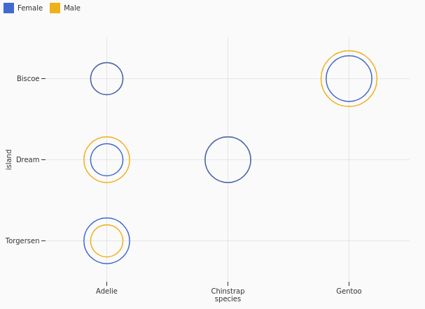
Ordinal Scatterplot
OrdinalScatterplot
Shows relationships between ranked or ordered categories on both axes, helping reveal patterns across ordinal dimensions.
Beeswarm
Beeswarm
Packs points without overlap along one primary dimension, exposing the distribution of individual observations while avoiding hidden or stacked markers.

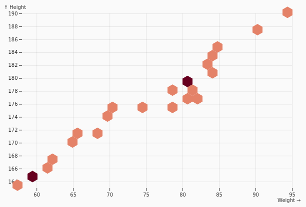
Hexbin Heatmap
HexbinHeatmap
Aggregates dense point clouds into hexagonal bins and colors each bin by count or another summary value to reveal density patterns.
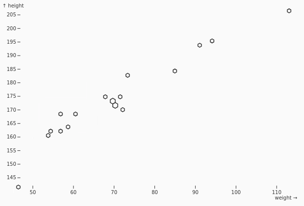
Sized Hexbin Heatmap
SizedHexbinHeatmap
Encodes a bin aggregate through hexagon size, helping compare local density or magnitude across a hexagonal spatial grid.
Hexbin Text
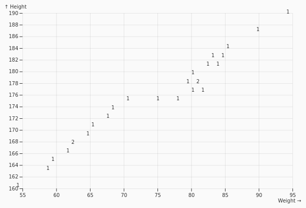
HexbinText
Places aggregate labels such as counts, averages, or other summary values inside hexagonal bins for precise reading of binned point data.
Voronoi Labels
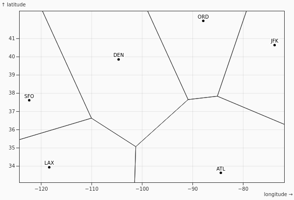
VoronoiLabels
Uses nearest-point Voronoi regions to place, associate, or resolve labels around scatterplot points with less ambiguity and overlap.
Stem & Leaf Plot
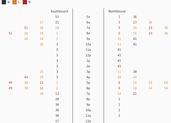
StemLeaf
Preserves individual numeric values while showing the overall shape of their distribution, combining compact summary structure with readable raw values.
Dot Histogram
DotHistogram
Represents frequency with stacked dots instead of solid bars, making counts more tangible while retaining the familiar histogram layout.

Proportional Symbol Scatterplot
ProportionalSymbScatterplot
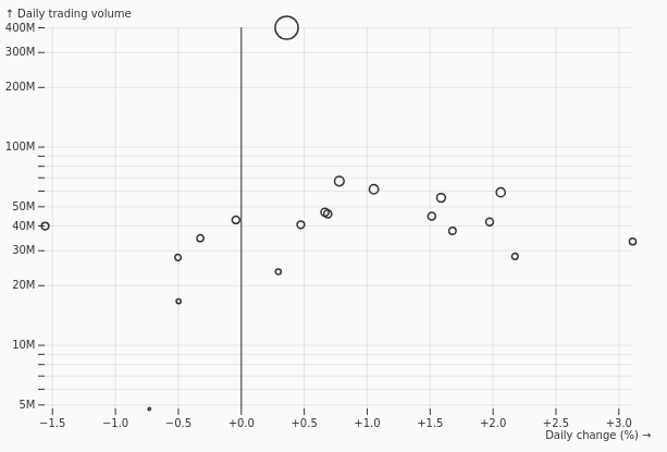
Maps a third quantitative variable to point size, allowing x position, y position, category, and magnitude to be compared in one view.
Ordinal Dimension Scatterplot
OrdinalDimScatterplot
Combines an ordered categorical axis with a quantitative dimension to compare measured values across ranked or sequential categories.